Samsung Library Time (S LIME)
Digital books, easier to discover, buy, and read.

Samsung Library Time, known as S LIME, was a reader app for Samsung phone users in Indonesia. It started with free magazines and newspapers, and the next direction was to introduce paid e-books. Adding e-books changed the role of the app. It now had to support browsing and purchasing while still catering to people who came to S LIME for free publications. The project became an opportunity to redesign the app as a whole and create a new direction for S LIME.
Role
Product Designer
Years
2021-2022
Skills
Product Design, Interaction Design, Mobile App
The Problem
The project had two main challenges:
Introducing a new business model: S LIME was originally an app where users read magazines and newspapers for free. Adding paid e-books introduced a completely different experience that had to fit into the existing product.
Making the app more engaging: The redesign also needed to give S LIME a fresher experience and encourage users to engage with the new e-books while continuing to support existing users.
My Role
I was the product designer on this project. I worked across the design process, from research and exploration to high-fidelity design, usability testing, and final design.
Research
Competitive Research
I started by researching existing reader apps in the market. I laid them out in Miro so I could compare the experiences side by side. I looked at both the overall experience and the details of the features, especially how users explored books, read them, and made payments.
A few things stood out:
Clear content categories: S LIME had three types of content (books, magazines, and newspapers) so they needed to be easy to distinguish.
Sorting: Sorting by Latest, Rating, and Most Read could help users explore books more efficiently.
Simple reading UI: The reader should stay simple while still allowing enough customization for different preferences.
Low-commitment actions: Free pages could encourage users to try a book before committing to it.

User Research
To understand what mattered to readers, I interviewed both avid and casual reader.
I asked around 20 questions and processed the results qualitatively. The questions focused on three areas: where people were today, their experience with e-book apps, and what they wanted to change.
Some of the findings:
Bring some physical book experiences into digital reading: One idea from the interviews was allowing readers to stick a note onto a page, bringing a familiar interaction from physical books into the digital experience.
Make reading more focused: Participants mentioned distractions from phone notifications. A reading mode that could block notifications could help users read without interruption.
Make browsing more engaging: The homepage should feel more like browsing in a bookstore, giving readers something enjoyable to explore rather than simply presenting a list of books.
Keep payment simple: For an Indonesian audience, familiar payment methods such as GoPay and OVO were important considerations.
Bring recommendations closer to the reading experience: There was also an opportunity to work with book reviewers or authors and bring their recommendations into S LIME.

Ideation
The first wireframes reflected the research findings while incorporating Samsung One UI into the design direction. I explored ideas across three parts of the experience: discovering books, purchasing them, and reading them.

Easier access to book synopsis
User research showed that the synopsis played an important role in deciding whether to buy a book. I explored a pop-up synopsis that appeared when users selected a book cover. They could then swipe to view another book without opening each book page individually. The idea was to make comparing books faster while browsing.

Bringing reviews and recommendations together
Reviews and recommendations also influenced whether users decided to buy a book. I explored bringing reviews and recommendations from different sources into S LIME, including Goodreads and social platforms such as YouTube and Instagram. I also explored creator profiles, allowing users to follow reviewers and build a book community within the app.

Bite-sized reading
S LIME already provided free pages, so I explored using small pieces of content as another way for people to discover something while browsing. The idea was to make browsing more engaging and help users find books they might not have planned to look for.

Notification Block
Reading on a phone can easily be interrupted by notifications. I explored a notification block that would allow users to turn off notifications while reading, creating a more focused reading experience.

Screen Time Reminder
I also explored a screen-time reminder to help users keep track of how long they had been reading. The reading time could then be turned into statistics that users could review later.

Sticky Note
To bring some of the physical book experience into e-books, I explored a sticky note interaction that allowed users to place a note directly on a page. The goal was to make annotation feel more casual and familiar in a digital environment.

App Requirements
Considering the project timeline, the earlier phase focused on smoothly introducing S LIME as an e-book reader while maintaining its existing publication experience.
The MVP allowed users to:
Browse and purchase e-books.
Read e-books comfortably.
Access and read free newspapers and magazines.
The redesign also focused on applying Samsung One UI components and refreshing the overall look of S LIME. The additional features and ideas explored during the design phase were planned for later phases.

Usability Testing
After defining the requirements, I designed a high-fidelity prototype and conducted usability testing before development. The testing was behavioral. I created simple tasks and observed how users interacted with the app, looking for problems as well as opportunities to improve the design.
Testing was conducted both online and offline with participants who read books and those who did not. The participants were mainly Samsung phone users. I used the findings from the testing to refine the design before development.
One critical part of the redesign was helping users distinguish between free publications and books available for purchase. Visual tags and separate sections made the difference clear while keeping both within the same experience.

Information Architecture
The information architecture was designed around the different types of content available in S LIME. Books, magazines, and newspapers needed to be clearly differentiated while still feeling like part of the same product.

Final Design
The new S LIME was released in February 2023. The redesign introduced e-books alongside the existing free magazines and newspapers, giving S LIME a new direction as a reader app.
Introducing a new business model
E-books were integrated alongside free magazines and newspapers. Visual tags and separate sections clearly distinguished paid books from free publications, while keeping both within the same experience.
Making the app more engaging
The redesign gave users more ways to discover books through the homepage. The refreshed UI following the Samsung One UI also familiar with users, increasing trust and ease of use.
Before

Final Design

Feedback
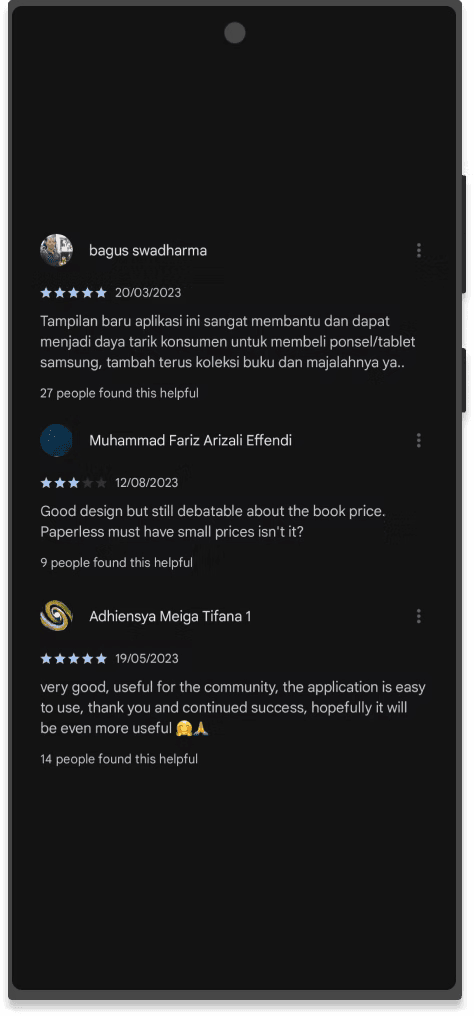
S LIME currently has a 4.0 out of 5 rating, and the feedback around the design has been positive.