SmartThings Analytics Dashboard
Making data easier to read, faster to understand.

SmartThings connects hundreds of millions of users to thousands of devices worldwide. The analytics dashboard behind it is used daily by thousands of users from various countries, spanning a wide range of roles including product and ops teams.
Over time it had grown to nearly a hundred pages with most looking identical. This was an unrealized problem for most users as they tend to work with what they are given. The redesign was a challenge to improve the interface and, most importantly, how users interact with data.
Role
Product Designer
Years
2022-2023
Skills
Product Design, Design System, Data Visualizations, Dashboard
The Problem
The dashboard's main problem was the lack of visual hierarchy and categorization.
Hierarchy: Every card looked the same. Same layout, same visual weight, regardless of how important the data was. Less important data took up as much space as more important data, making every page unnecessarily long.
Categorization: Each page usually carried a few groups of related data, but they looked similar and repetitive. People understand data better when it's grouped with meaning.
Unclear hierarchy and disorganized data meant users had to read every card fully just to understand what they were looking at, and even longer to grasp the context within it. To help users reach their actual daily goal of making decisions and getting insight, the data had to be easier to read and faster to understand.
My Role
I was the product designer on this project, collaborating with my design lead and the SmartThings Analytics Dashboard technical lead to get feedback and discuss technical feasibility. Otherwise, I conducted the entire design process until the final design handoff.
Discovery
I laid out the dashboard pages side by side, and the repetition was obvious right away. From there, the hierarchy and categorization problem became clear.
I also looked at other dashboard services like Tableau. What stood out was how much of the dashboard experience came down to design decisions rather than the tool itself. Tableau lets you customize almost everything, which made it clear that the quality of a dashboard lives in the choices the designer makes, not the platform.
Before moving into ideation, I conducted focused research on color usage in data-heavy interfaces. I found that soft, intentional colors and breathing room between cards made dense data seem manageable and not overwhelming. This became the foundation for the color direction in the next phase.
Ideation
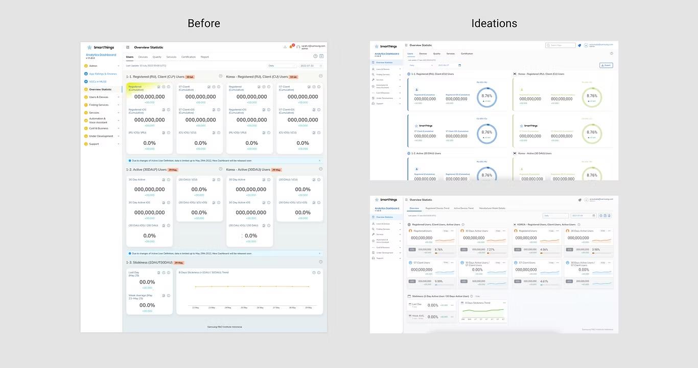
I started ideation on my own, exploring color and icons as context and strategic layout as the two main directions. My design lead brought in a third: card optimization, using smaller, denser cards to fit more without losing clarity, along with stronger data visualization. I took all three directions and developed them further, working out how they'd actually function across the dashboard.
Not everything worked. Larger cards were tested early on but dropped, since they took up too much space without adding clarity. The color, icon, layout, card, and visualization directions all held up, and became the foundation for everything that followed.
Usability Testing & Iterations
Since the dashboard is used by internal teams, I tested with product managers and data analysts within the company. They work with the dashboard regularly, making them the right people to test with. I iterated on the design based on feedback between rounds. A few key findings shaped the final design:
Strategic layout worked: Participants said the strategic layout and icons helped them read and understand data faster.
Colors needed two separate systems: Dashboard theme color and data colors need to be different from each other. Mixing them created confusion about what the color was signaling.
Context of colors: A reddish color like salmon still signals danger to users when applied in a chart. Color meaning also varies by region. In South Korea, red indicates an upward trend. Since the dashboard would be used worldwide, we decided to avoid red-adjacent color altogether to keep a neutral tone. Red is only used when I want to grab attention, such as for declining data.
Space optimization: The more data that fits on one page without scrolling, the better. Other design elements should not compete with the key content of the page.
Design Principles
Testing confirmed two things mattered most: how fast someone could read a single card, and whether that same design held up across every context the dashboard lived in, from a scrolling desk view to a no-scroll screen in a meeting room. These became the two principles behind every decision that followed.
Faster Data Consumption
The old dashboard made every card look the same, so users had to read each one fully just to understand what they were looking at. The goal was to let users grasp a card's meaning almost instantly, through color, icons, and hierarchy, rather than by reading.
Color signals meaning, not decoration. Data colors and dashboard theme colors are kept as two separate systems, so a color always means the same thing wherever it appears.
Icons carry recognition. People process images faster than text. Icons help users identify a card's content before they read a single label.
Hierarchy separates signal from support. Every card has one primary metric and, where relevant, supporting context beneath it. Size and position always follow this order, so users learn to scan the same way across every page.
Clear at Any Scale
The dashboard is viewed in very different contexts: at a desk, scrolling through dense pages, and on a large screen in a meeting room where nothing scrolls and VPs need to understand a page with no time to explore. A design that only worked in one of these contexts wasn't good enough.
Space is treated as a resource. The more relevant data that fits without scrolling, the better. Nothing on the page should compete with the content for attention.
Layout carries meaning. Comparable data sits side by side; more complex pages combine horizontal and vertical placement to guide reading order deliberately, not by default.
Color stays legible across regions. A reddish tone reads as danger almost everywhere, and even signals different things by region, so red-adjacent colors were avoided across the board to keep the system globally legible, reserving red only for moments that genuinely need attention, like declining data.
These two principles shaped every decision in the redesign. To make them reusable beyond a single project, they were built into a design system.
Design System
The design system translates both principles into components and guidelines the whole SmartThings ecosystem could apply consistently, not just this dashboard.
Color System
Two separate palettes: a dashboard theme, used for sidebar, buttons, and other accents (passed WCAG AA), and a set of 12 data colors, expandable as needed. Data colors are assigned per page rather than per data type, so the system stays flexible without needing new color logic for every new page. The set was chosen specifically for long viewing: bright enough to distinguish at a glance, not saturated enough to fatigue someone analyzing charts for an hour.

Icon System
People process images faster than text. A well-chosen icon helps users build familiarity quickly and navigate by recognition rather than reading. Each icon in a card can carry a data color or a neutral grey, depending on the context needed within the page.
Card Optimization
I reviewed each card and asked: what's the primary number here, and what's supporting context? Restructuring around that question created clear hierarchy in the data:
Size: The primary metric gets the largest, brightest treatment. Supporting figures are smaller and less bright, visually secondary.
Position: The supporting data is placed below the main data, signaling that it falls under the primary metric. The exact position may vary, but the order is always consistent: main data first, then supporting data.
Data visualization: Where a trend line or progress chart improved how quickly someone could get insight, I added it.

Strategic Layout
Layout is a design tool as much as color is. Cards already have colors within them, so the next step is to place them strategically to make the data even easier to understand.
Position: Comparable data is placed side by side. More complex pages combine horizontal and vertical placement to guide the reading order.
Card size: Card size is initially decided when optimizing the cards, but it can also be influenced by layout. In this dashboard, the layout is divided into a 12-column grid with 5 predefined card sizes. The defined sizes help keep the layout well-structured and consistent.

Final Design
The redesign changed how the dashboard displays data, from pages of identical cards to organized data with clear hierarchy, built on a sustainable design system with a consistent color system, standardized card components, coordinated data color sets, and strategic layout. Where a page once took a full scroll to parse, the same information now reads at a glance. The primary numbers are visible immediately, everything else clearly secondary.


Complex Case: Summary page
The same principles held up under significantly harder constraints. The Summary page is displayed on a large screen in a meeting room at headquarters, a context that changes the design problem considerably:
Bigger canvas, but no scrolling. Everything must fit on one page.
Limited interaction. The primary viewing context is a meeting room, so the page has to communicate without anyone touching it. Detailed information is still available on click for analysts who want to explore further at their desk.
Instant readability. Viewers are VPs in a meeting who need to understand the page without prior context or time to explore.
The page started as uniform tiles of raw data with no grouping or hierarchy. Applying the two principles transformed it into a categorized, readable dashboard that communicates the right information instantly, without the viewer having to look for it.
Feedback
One month after release, users rated the new dashboard 9.7 out of 10. Users adapted to the new design quickly, and the feedback came from teams across regions.
What Came After
As of 2026, three years after the redesign, SmartThings Analytics Dashboard continues to apply the two design principles when designing new dashboards. More complex dashboards have been designed using the same system, showing its flexibility and sustainability through cases like the Summary page.
The design principles and system are flexible enough to apply beyond SmartThings. Other dashboard projects handled by the design team in Samsung R&D Institute have adopted the same system and principles.